
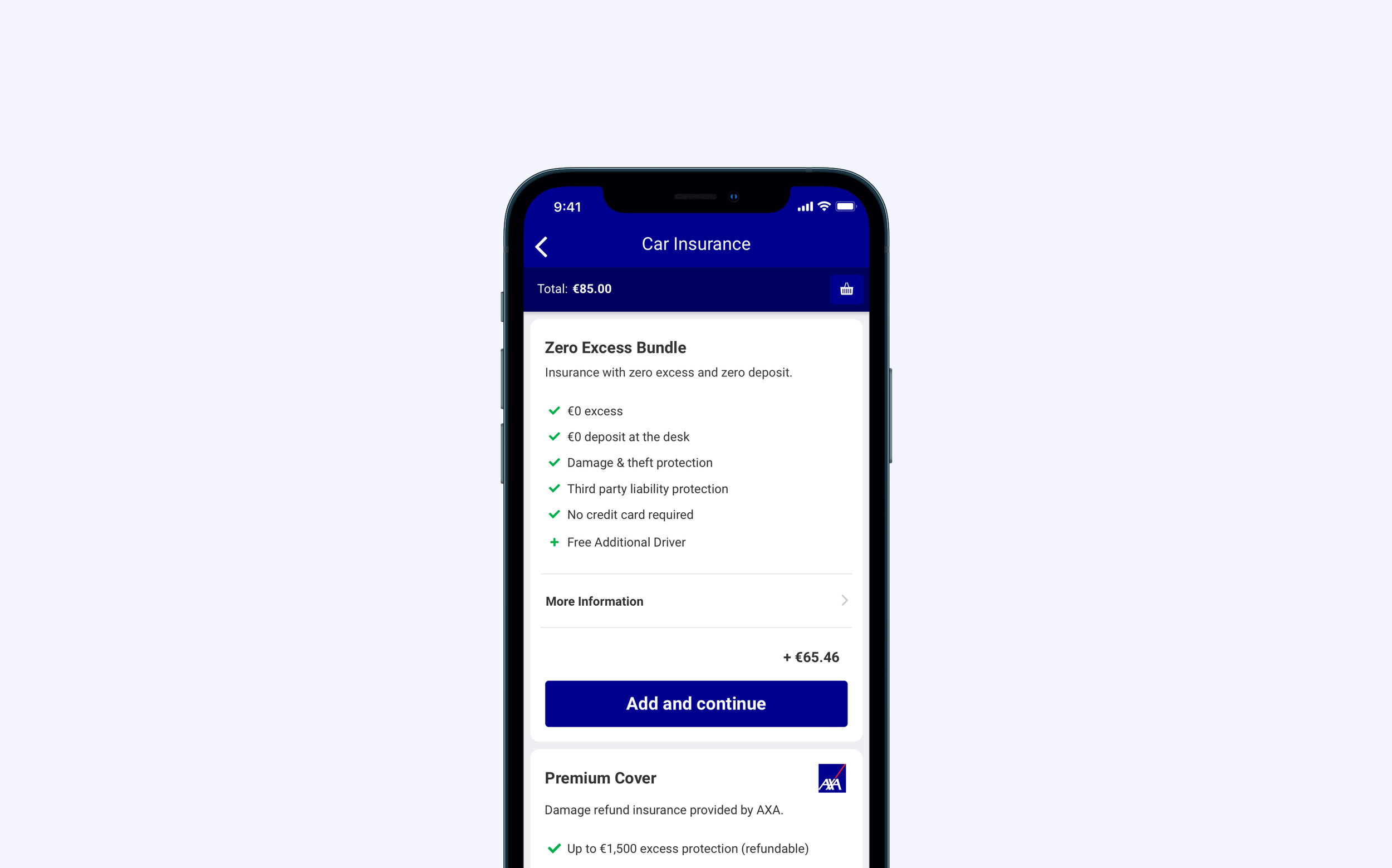
Improving CarTrawler’s car insurance offering
Role
Product Designer, Mobile (iOS & Android)
Background
CarTrawler is a car rental platform that partners with airlines and travel companies to offer customers choice on car rental. This project came from 3 business challenges:
Insurance complaints were in the top 3 customer contact reasons per month
Insurance conversion dropped 4% compared to the previous year
Car rental companies (Hertz, Avis, Europcar) offered customers more choice at the desk for insurance cover
The Process
1. Immersion & Research
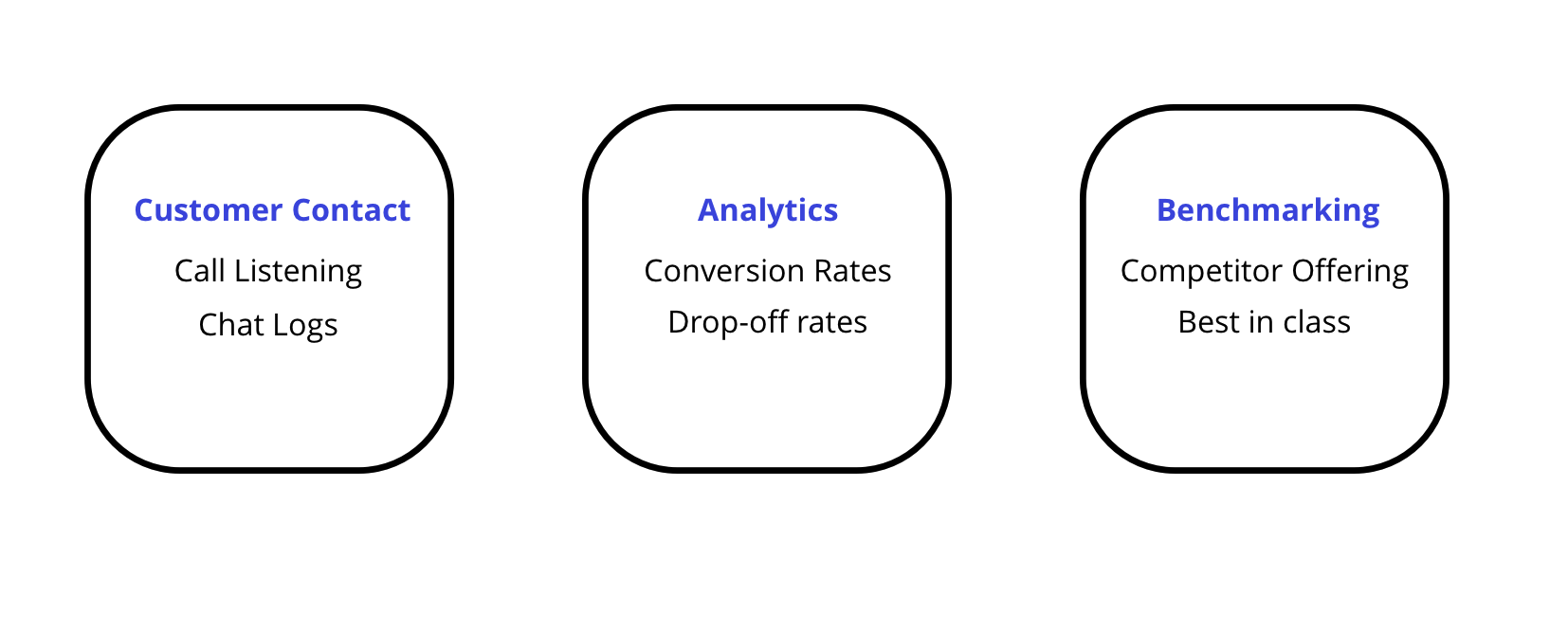
There was an intense lead in time of 1 week before the project kicked off. We started with some initial research. The team collectively captured information from the customer contact centre, our analytics dashboard and by doing a benchmark with competitors.
I created and shared an affinity diagram with the team. Collectively, we identified themes. From this, 4 key insights emerged.
Insight #1
Insurance comprehension & trust
Customers do not fully understand what insurance they are buying when booking on our site. Customers also didn’t realise you had to pay for damages up front to car rental agents and then claim this back. There was a lack of trust with customers because of this.
Insurance was the second highest call driver for our contact centre.
Superior competition cover
Car rental agents offer superior cover. Customers were calling at the rental desk were trying to cancel our insurance to buy better cover.
Insight #2
Insight #3
Customer choice
Despite offering more choice for cars, there is less choice of insurance. Competitors are offering more types of insurance cover for their car rental.
Lower conversion
Conversion rates dropped 4% vs the previous year and the abandonment of the cart at insurance was trending higher than the previous year.
Insight #4
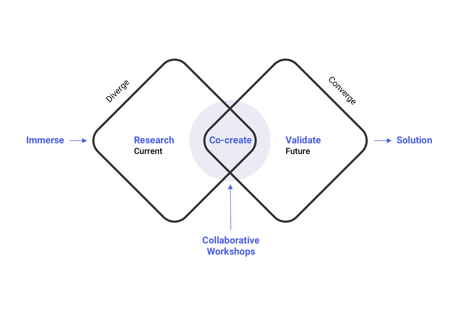
2. Co-Create (Collaborative Workshops)
I facilitated a workshop with stakeholders across CarTrawler. We used design methods to define the challenge for the project by developing a long term goal, creating ‘How Might We’ (HMWs) statements and surfacing sprint questions to ensure we were aware of what might make the project fail. We also created a map to ensure all actors and their actions were identified for this new insurance product.
Each of these activities were voted on and prioritised by the stakeholder group. It aligned stakeholders and gave a clear direction and scope for the project.
After defining the challenge and scope for the project with the initial workshop, we quickly started to come up with solutions to test quickly with our users in a second workshop. To help ideation, we had lightning talks with different people across the company to discuss mobile design patterns, our current insurance offering, what the new insurance offering will include and best practices from other products in our industry and externally. I encouraged note taking and sketching during these talks.
Each team member in the sprint created a sketch of the solution based off the HMWs, Long Term Goal and the Lightning Talk inspiration and annotated them to put up on the wall. The team collectively voted on the best solution closest to the goal of the project (below).
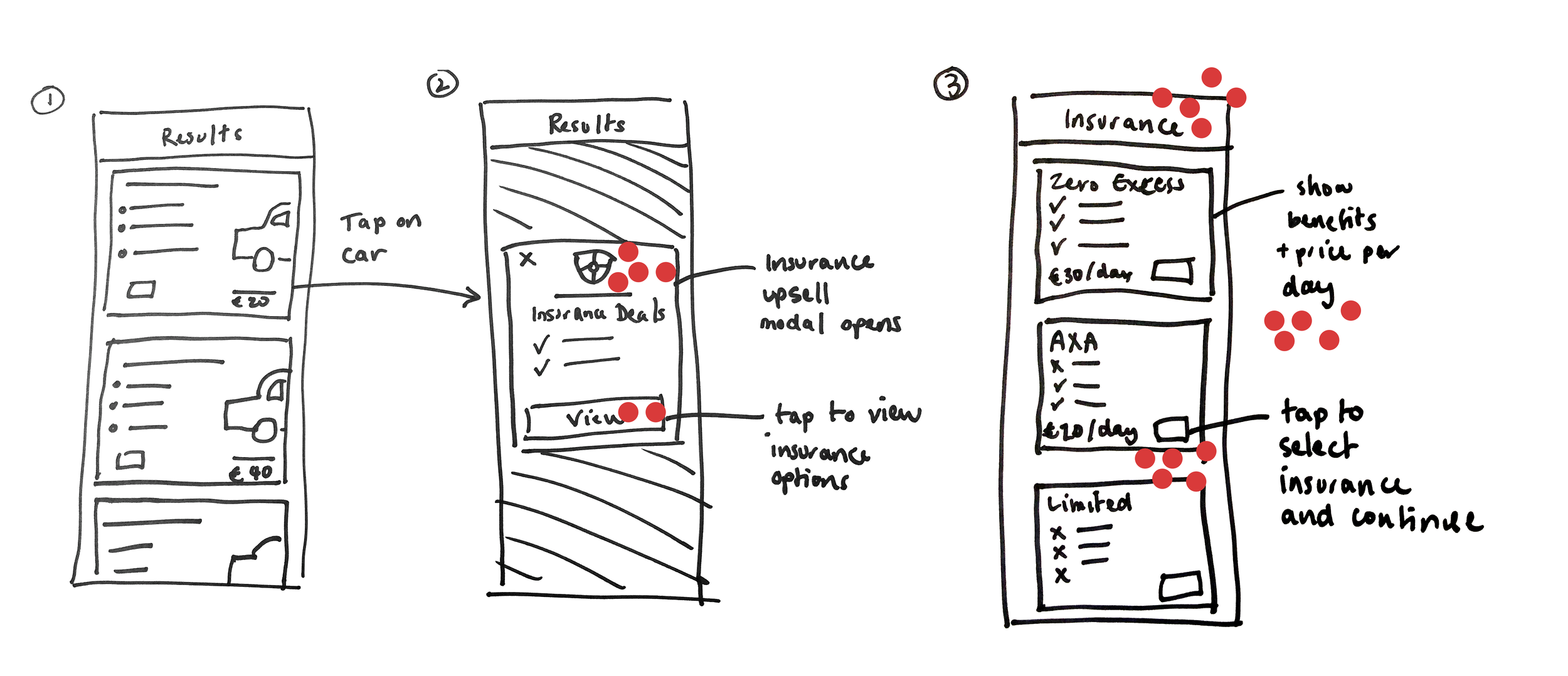
We created a user testing flow in the room to aid in prototype development. Each team proposed a flow and then we collectively voted on the best approach.
3. Validate
User Test 1
Based on the decided sketch concept and the user testing flow from the workshops, I developed a prototype for customers and put this live for unmoderated testing.
I used Sketch and InVision and our system libraries to develop the prototype and used User Zoom to as the recruitment and testing tool. We did this to test, learn and iterate quickly with 6 users.
I wrote the script for the test and identifying the following goals for success. Beside each goal, I have identified the task success rate for each user.
2/6 - Understood the different insurance options
3/6 - Could compare insurance offers easily
2/6 - Understood what they were covered for
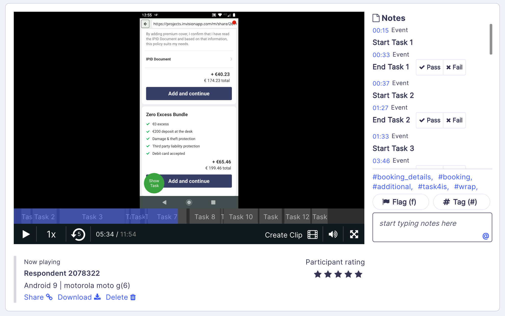
Results of the unmoderated user test were circulated to the stakeholders via an insights report I created including user test video clips and the success or fail criteria for each goal. It was clear customers we getting confused from the initial design built out from the workshop concept.
Iteration: User Test 2
I used the insights to iterate and refine the design. To make the different options clearer, I split each insurance option into 3 cards - a design pattern we use for car comparison. I also did a list comparison with each item listed in the same order on each card. We agreed to conduct another test and the success rates were much higher.
6/6 - Understood different insurance options
6/6 - Could compare the insurance offers easily
4/6 - Understood what they were covered for
It was agreed we need to improve how we explain what customers are covered for and the language we use to explain insurance. For the first version, stakeholders were happy to go live with this design and improve after gathering more data.
4. The Solution & Outcome
There were two design iterations during user testing and then iterations of the flow were updated during detailed design after discussions with development. Once built, it was AB tested with our customers at launch.
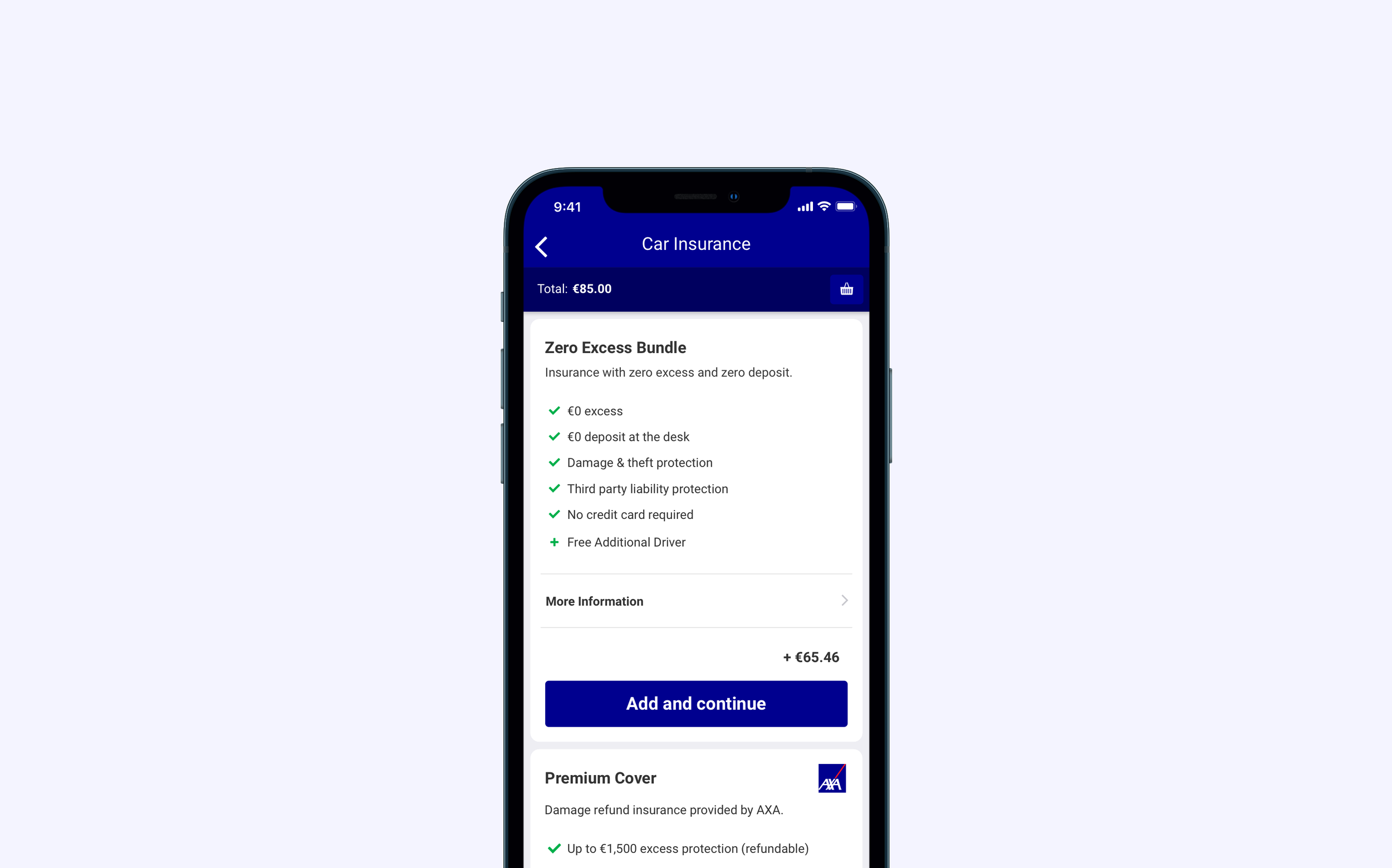
A great outcome of this project was making our all our insurance product offerings clearer and easier to compare with regardless of the insurance provider and cover. It was also scalable to work across different insurance providers and across different countries and regions. An example of scalability applies to another insurance display without zero excess insurance available.
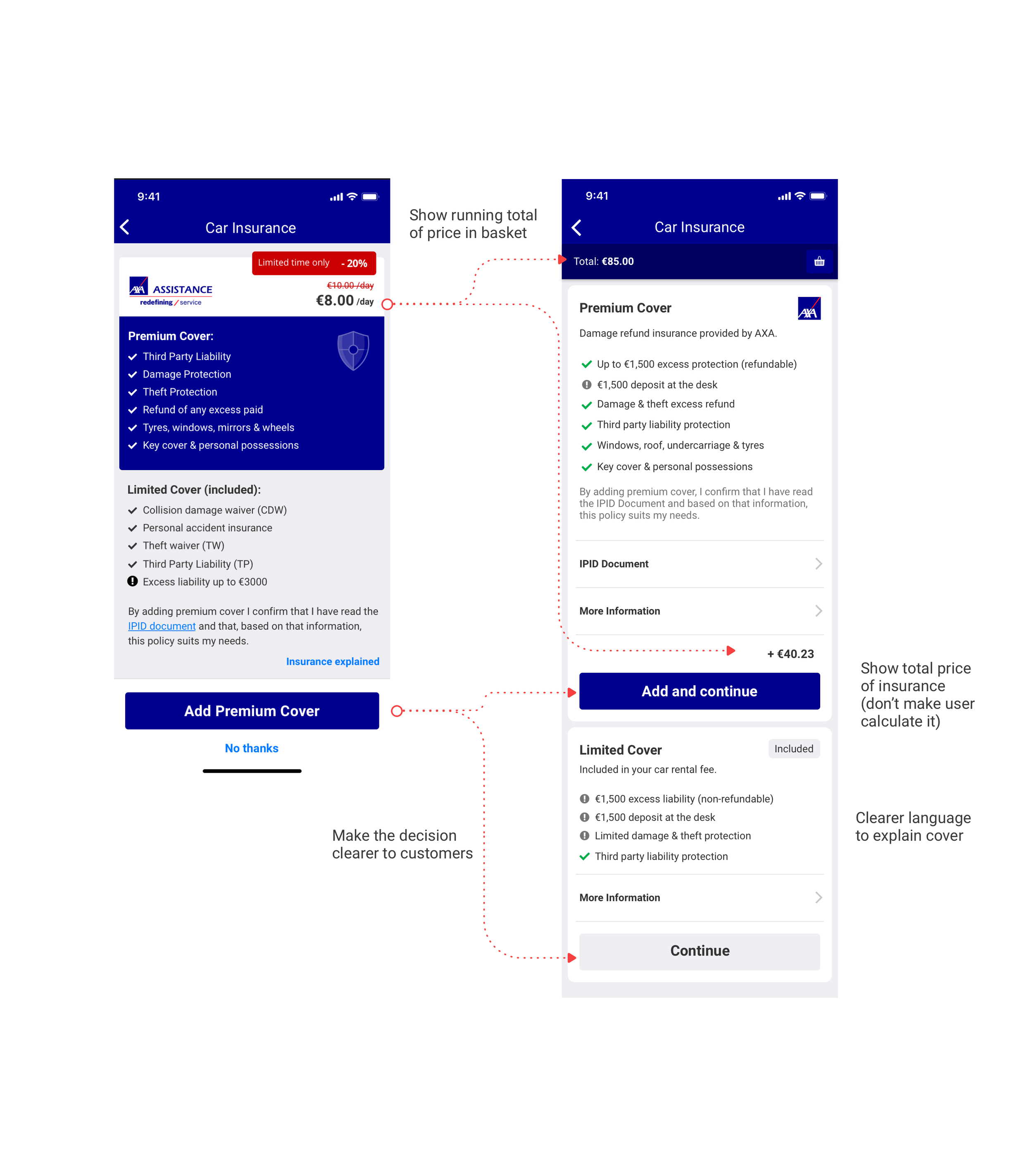
The new insurance offering resulted in no uplift for insurance conversion on the new design in the AB Test over a 1 month period. However, we measured a 10% reduction in customer contacts for insurance over 1-month period after launch and a 4.4% uplift in margin per car rental. This combined with the strategic move to go straight to car, was enough for the key stakeholders to agree to put the new flow live.
There has been two iterations of this product shipped to date and enhancements to improve content are in the pipeline. This project opened the opportunity for CarTrawler to offer straight-to-car solutions where there is no car rental desk experience.
The new insurance product display was successfully put live across all products. You can find it in easyJet’s app (CarTrawler partner) on iOS and Android.